RAICES
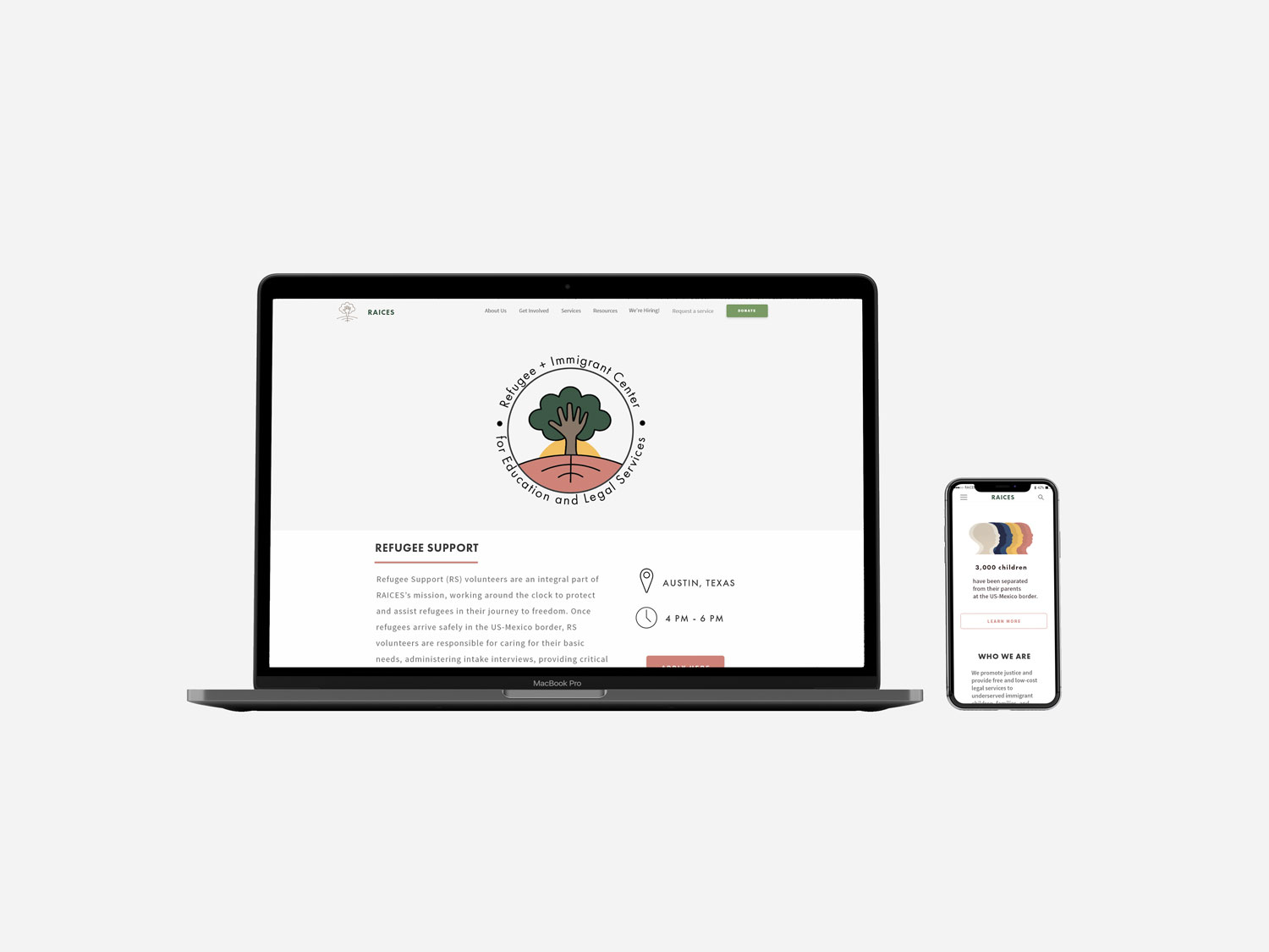
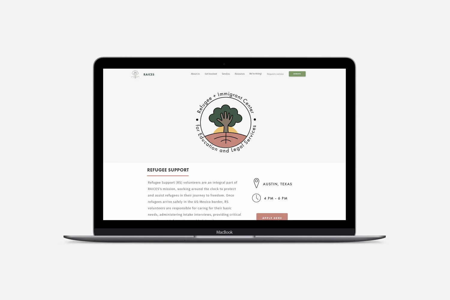
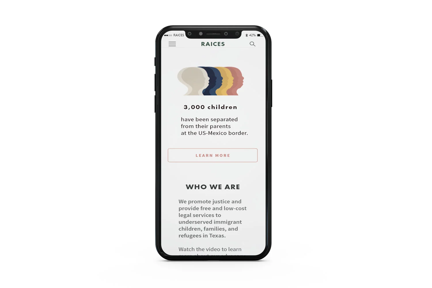
Responsive desktop + mobile design for Texas based nonprofit
OVERVIEW
Our team was given the task to redesign the website and mobile experience of a nonprofit of our choosing over a 2 week period. We chose to redesign RAICES, an organization we were all equally passionate about.
RAICES is a Texas based nonprofit that offers free and low-cost education and legal services to low-income immigrants and refugees. The organization is committed to advocating for separated and detained families through pro-bono legal representation in court and providing social services that empower community.
Supporting immigrants and refugees struck an emotional chord with me since I volunteer as an ESL Teacher and Mentor with a refugee family from Congo on a weekly basis. The experience has been personally rewarding and I wanted to encourage others to also find ways to also get involved in the community.
CLIENT
TEAM
MY ROLE
SKILLS
RAICES
CHRISTINA NGUYEN
ANGELICA GUAJARDO
CLAIRE TRAMMEL
user research
USER RESEARCH
USER INTERFACE DESIGN
VISUAL DESIGN
PROBLEM statement
RAICES recruits a low number of volunteers despite immigration being a hot topic issue. The homepage is cluttered with text making it difficult to identify a call to action and navigate to the volunteer form.
DESIGN SOLUTION
In order to streamline the volunteer onboarding process and increase volunteer form completion, our team set out to redesign the RAICES site to be more responsive for both mobile and web. Improving the overall experience of volunteer sign-up required us to connect with our users to gain insights on how to reorganize the information hierarchy, refine the user flow, and simplify the onboarding process to be more efficient.
Empathize
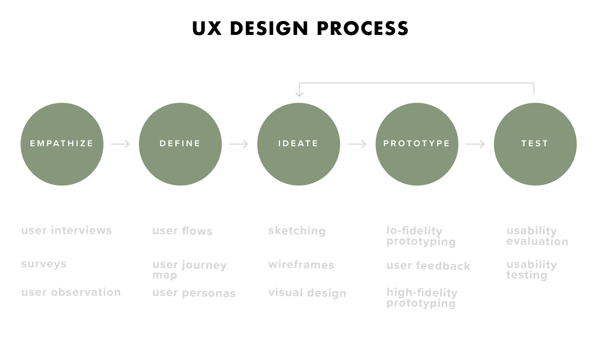
The first step in the research plan and redesign process was to better understand our target audience and explore their motivations, needs, goals, and mental models. Developing empathy for our audience required the use of research techniques such as user observation, surveys, and interviews.
Key Research Areas
Observe users' current volunteer form completion process
Understand the notable behaviors, preferences and technological barriers that impact volunteer form usage
Identify needs and opportunities to inform redesign strategy
Surveys
We first needed to identify if we were solving for a real human need. I designed a questionnaire on Google Forms with 20 participants to identify who our target audience was and if volunteering was of interest to them. I also wanted to gauge the overall familiarity and first impression of RAICES. The survey resulted in the following key findings:
75% of participants are interested in volunteering in some capacity
80% of respondents have never heard of RAICES
85% of the group are under the impression you have to be a law student or attorney to volunteer with RAICES
“It didn’t feel like I was signing up to volunteer. It felt like I was applying for a job I wasn’t going to hear back from.”
“The form was really long…ain’t nobody got time for that.”
“I kept having to click around to find more information.”
User Interviews
The survey allowed me to gather information about my group in minimal time, but the anonymity of some participants impacted by ability to follow up and ask for clarification. I wanted to interact directly with respondents, so I supplemented the survey with directed in-person interviews.
The interviews allowed me to find out what annoyed our users:
The forms were too long to complete
The different volunteering opportunities were crammed randomly around the site
Lack of inspiring content
Unclear requirements and volunteering expectations
Define
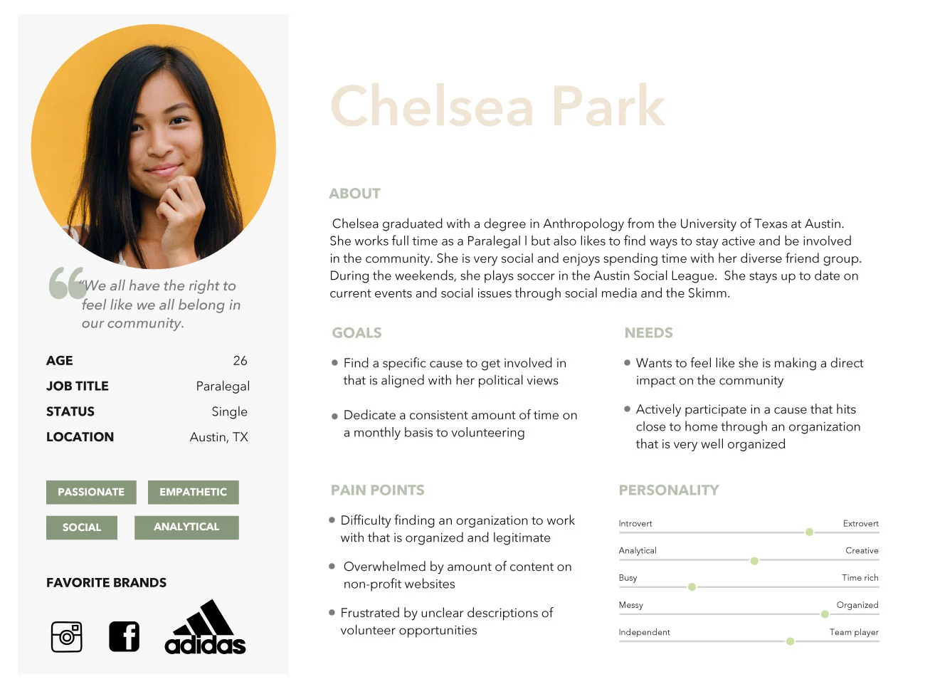
I took the insights we generated from our in-person conversations and survey to define and create user archetypes. We synthesized our findings to craft a user narrative to better inform how we can redesign the RAICES user flow.
user persona
From the data collected during our primary research, I crafted three user personas.
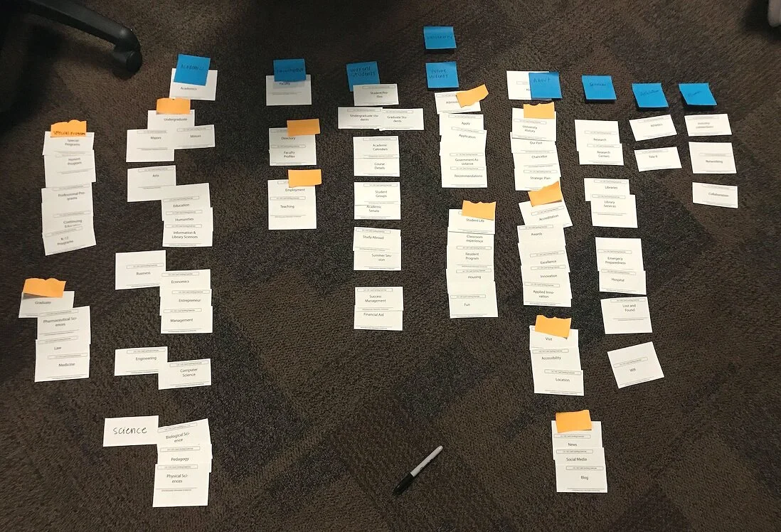
CARD SORTING
USER FLOW
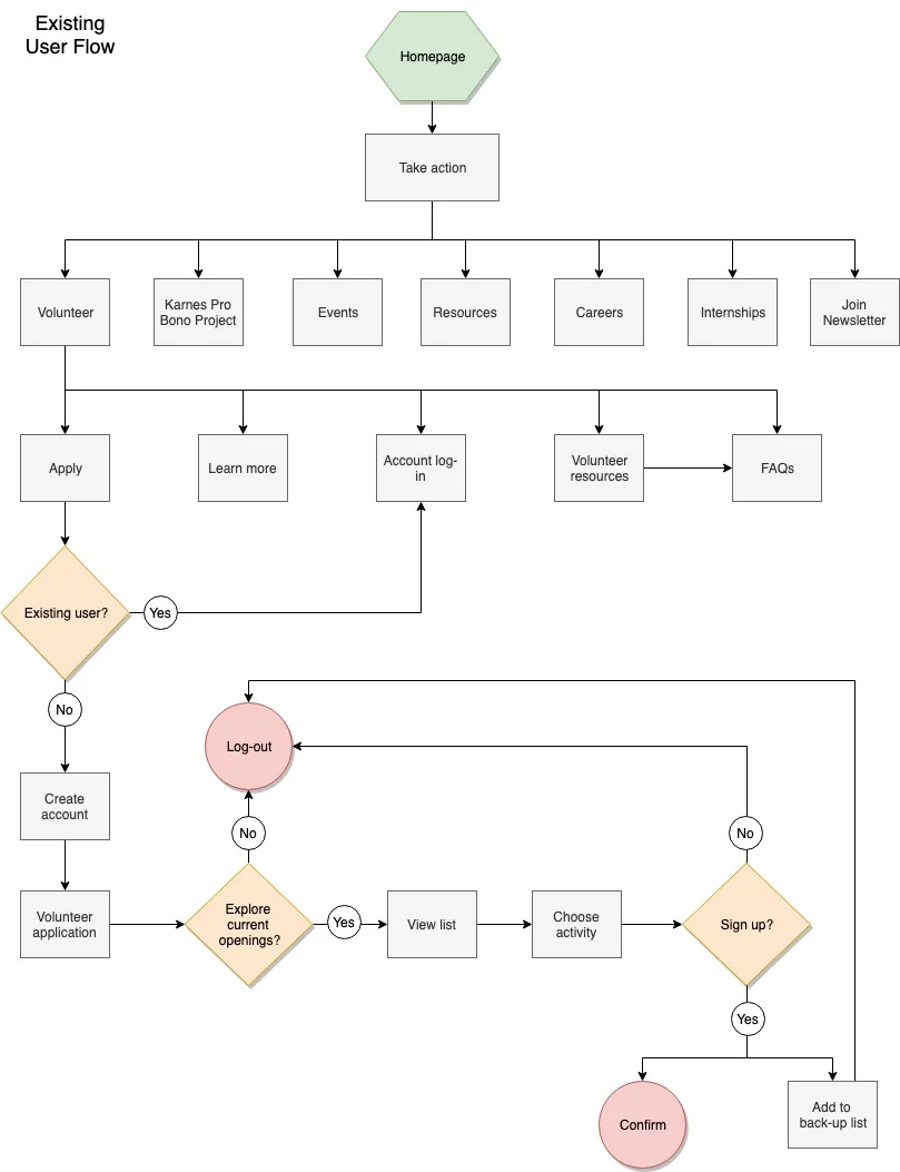
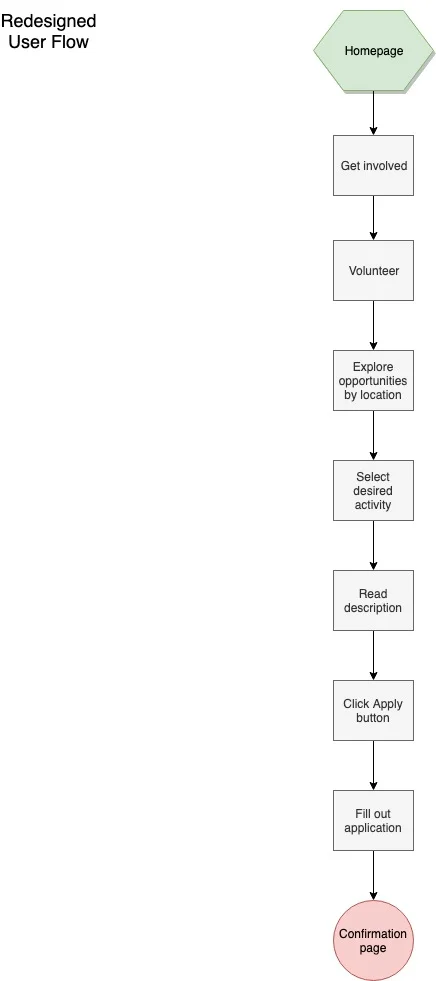
We wanted to ensure that our user is able to find and navigate to the volunteer form easily from the homepage. To better understand how the user was getting from point A to point B, we laid out a few user flows. The flows visually showed us how all the pieces were interacting and how we can better map out the content to simplify the sign-up process. The original flow was confusing with several cyclical steps that increased user friction such as requiring account sign-up or log-in before exploring volunteering opportunities. Our revised user flow took out these roadblocks which resulted in a more linear, straight-forward process.
USER JOURNEY MAP
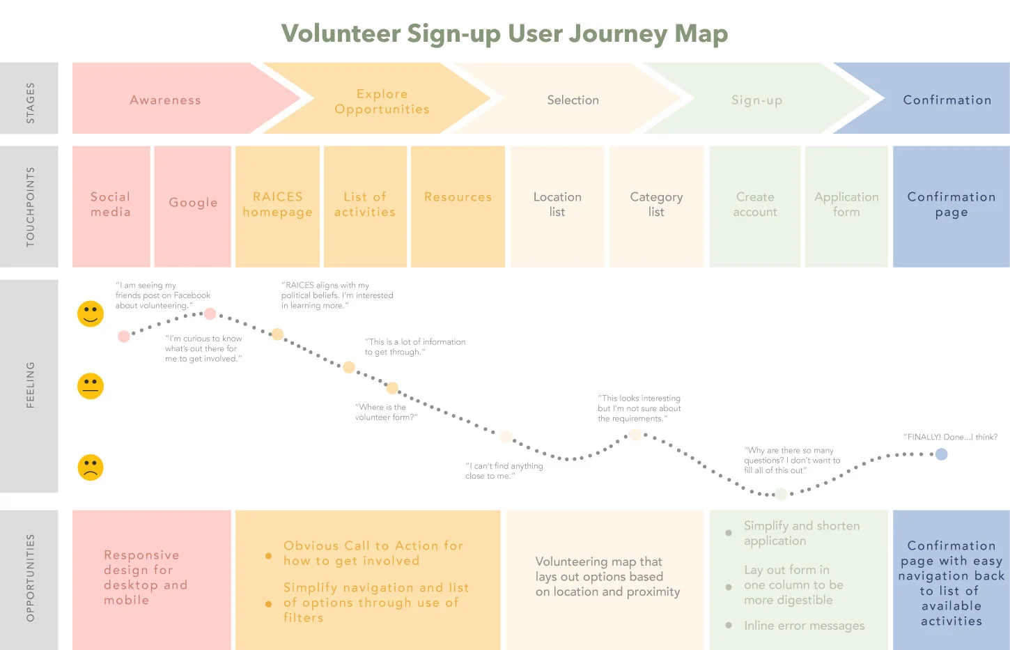
Where are the touchpoints when the typical persona would interact with the RAICES volunteer form - from first learning about it to applying to be a volunteer? I wanted to understand the emotional journey of our user - the highs, the lows, the good, the bad (and hopefully not the ugly.) Creating a User Journey Map allowed me visually break down the negative and positive steps in the user's overall experience and to ensure that the journey ended in a satisfying way.
Ideate
SKETCHES
WIREFRAMES
STYLE GUIDE
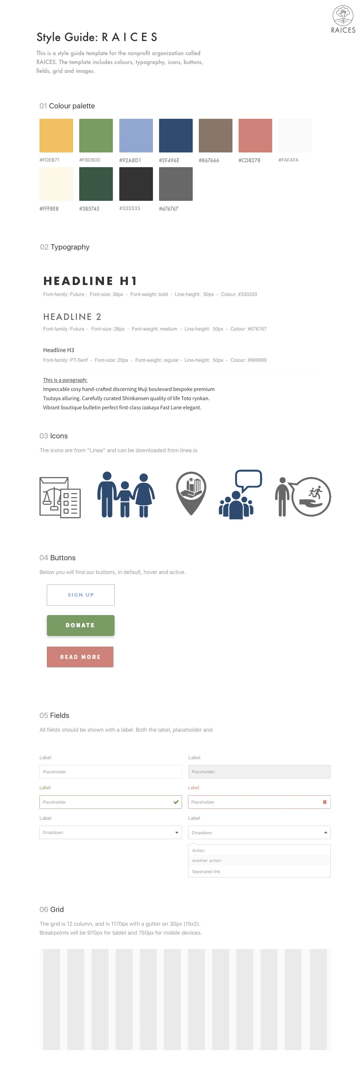
The RAICES website needed a complete visual overhaul, so we laid out the guidelines and designed new visual elements that would make the nonprofit more engaging and clean. The Style Guide also ensured that our team was on the same page and that our design remained consistent.
Logo
We kept the original logo idea of a tree but wanted to alter it in a way that encouraged community. Changing the trunks and stems of the tree to be a "helping hand" was more aligned to the nonprofit mission of community outreach and unity.
Colors
The original colors were dull and dark. According to color psychology, our new color palette inspired optimism and warmth with yellow, signified growth with green, conveyed compassion and nurture with pink, and symbolized unity and stability with navy blue.
Typography
To create a website that was clean and minimal, we chose sans serif fonts that were easy to read.
Iconography
The use of monochromatic, linear iconography was visually informative without being too distracting.
Test
Task Scenarios
Task Scenarios were crafted to test how effective the redesign of the information architecture was.
Find the volunteer page
Explore volunteer opportunities
Apply for volunteer opportunity of interest
Fill out volunteer form
After redesigning the “look and feel” of the interface, we needed to quantitatively and qualitatively test if we improved the overall quality of user interactions and increased the task completion rate of volunteer sign-up. To measure usability and spot potential user experience issues, we looked to 3 key metrics.
Task completion rate
Time on task
User satisfaction
TASK COMPLETION RATE
Of the 5 users tested, no one was able to make it to volunteer form completion. With the redesign, 100% of users were able to explore volunteer opportunities, apply, and fill out the form with ease.
TIME ON TASK
The average time to complete a task of volunteering onboarding was 4.58 minutes per task.
(2.8 + 5 + 3.5 + 7 mins) / 4 tasks = 4.58 minutes
After the redesign, the average time per task went down to 47.75 seconds per task
(10 + 45 + 16 + 120 secs) / 4 tasks = 22.6 seconds

